

It’s become pretty difficult for breweries to create beer naming and branding that is unique. Every name, color scheme, etc has been taken (or so it seems). For those that are able to create brilliant branding, they will find that their fans will do much of their marketing for them. Making Instagram worthy craft beer labels is truly important to how often a beer gets shared on social.
Every brewery should consider social media, specifically Instagram, when approaching their craft beer label design. Through social media; craft beer fans are marketing their favorite breweries every time they drink.
Instagram Worthy Craft Beer Label Design
Let’s start with a couple of basics about what I look for in the label design of a craft beer.
Most breweries tend to have a standard image, theme, or concept to how they market. This is especially true of a brewery that has more than a few products in distribution.
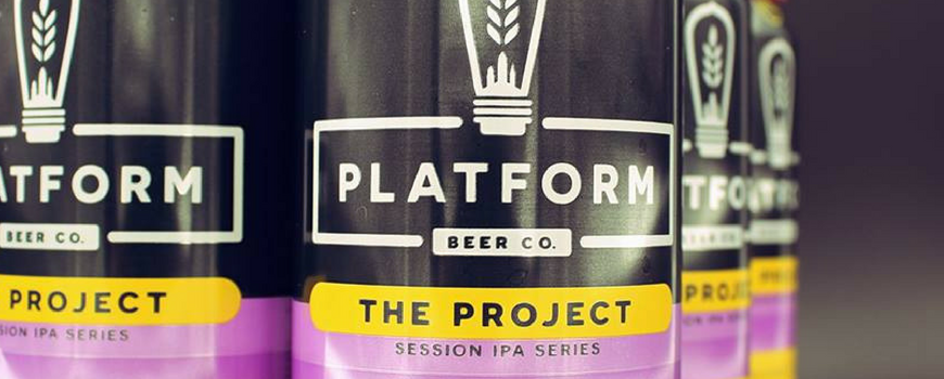
For many breweries, they have a set layout and just alter a few elements to make each beer different. Great Lakes or Rhinegeist are great examples of this kind of label design.
While other breweries seem to take a less structured view of how they use artwork. Listermann and Three Floyd’s are two breweries that I see using artwork as the foundation which makes each beer unique.
This foundation is critical for defining the way consumers view the brand. And determines how easily recognized they are in the market.
In addition, the brewery must decide what type of information they will be providing about the beer that must be worked into the label design. Most of this will be text based and can occupy a good portion of the label.

7 Things That Should Be On Every Beer Label
The Social (Media) Impact
Like most hobbies and sub-cultures, craft beer has taken to social media. Through Facebook, Instagram, Twitter, Reddit, etc.; craft beer enthusiasts are discussing, trading, and learning about craft beer.
Almost all of this is driven by pictures of what they are buying, drinking, or brewing.
Over and over, comments are made about “how good a beer looks”, “great artwork”, etc. The visual aspect of beer has become almost as important as the taste. While some craft beer purists will mock this, it’s the truth.
If you want your beer to stand out, then the first element you should consider is how your beer will look online.
Yes, the beer needs to taste good but that’s a given. Now people want their beer to look good too.
This applies to both the craft beer label design and the actual beer too. I won’t talk too much about the beer but consider the New England IPA. These hazy, juicy IPAs have a distinct, photogenic appearance and contribute to the hype and how often they are posted on Instagram.
But concerning the actual label design, if done well, craft beer drinkers will post pictures to show off their beer to their friends and fellow enthusiasts.
This is where the real magic of marketing happens; the customer is literally doing the marketing for the brewery at this point. More on what I think breweries should do to leverage this later.
Social Media In The Taproom
Most of what this article refers to is people drinking packaged beer with great label design at home, taking pictures of it, and posting it online.
But this idea also translates into the taproom. While it’s rare to find packaged beer in taprooms, beer fans are posting pictures of their experience. Breweries should really consider what this can mean from the perspective of social media.
I advocate for having branding glassware to help ensure the brewery’s logo makes it into the post. Also, consider taproom design providing great photo opportunities for people and beer.
Two breweries that stand out to me are Monkish and Modern Times. Both have well known wall art that makes for great social media posts. While I don’t think they have Instagram in mind when the art was created; it’s turned into something that every craft beer drinker wants to add to their social media profile as proof they’ve visited these breweries.

Learn More About Beer Branding
Clown Shoes: Instagram Worthy Craft Beer?
Clown Shoes Beer has iconic labels that are basically pieces of comic book art. Each beer is unique and the image makes you believe there’s an entire movie behind it. Fans have loved these label for years.
They just announced a huge change to their label design. While the artwork isn’t going away, they have a new logo (that will be more prominent) as well as other details taking up real estate on the front of the can. This means the artwork isn’t as featured as it once was.
What I am most excited about is they are adding a story on the back of the can. This will definitely help us better connect with the beer and artwork.
This makes me wonder, how will this impact their brand and marketing? Will more clear beer descriptors help educate buyers and increase sales? Will making the artwork less “in your face” make them less noticeable on shelves and less appealing to post on Instagram?
Or will all of this help them be better recognized as the top notch brewery that they are?
Only time will tell. I’m excited to get my hands on these new labels and see them up close. The new logo is really great and I love that they didn’t drop the artwork.
Clown Shoes Beer is taking a risk but I think it is a good one. Keeping your branding fresh is just as important as keeping your beer fresh. Let’s keep an eye on these new cans and see if they continue to be Instagram worthy craft beer. Which do you prefer?


Original Can Design (Left/Top) vs New Can Design (Right/Bottom)


